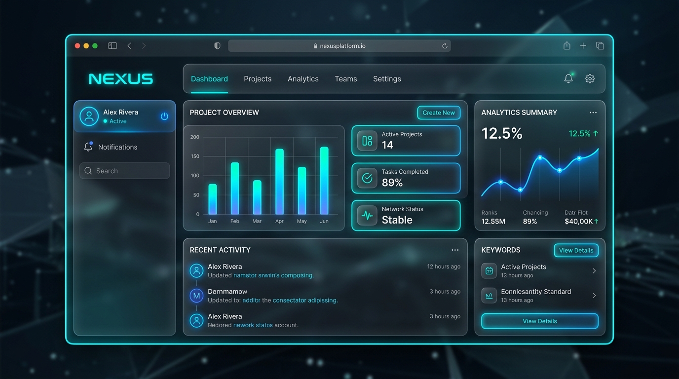
Glassmorphism creates a sleek, high-tech aesthetic by combining semi-transparent background layers, frosted glass backdrop filters, and subtle neon borders. Here is how I build production glassmorphic cards in WordPress and Elementor.
1. Core CSS Backdrop-Filter Token
The foundation of glassmorphism relies on hardware-accelerated backdrop blurring:
.tech-glass-card {
  background: rgba(15, 23, 42, 0.6) !important;
  backdrop-filter: blur(16px);
  -webkit-backdrop-filter: blur(16px);
  border: 1px solid rgba(56, 189, 248, 0.2) !important;
  box-shadow: 0 8px 32px 0 rgba(0, 0, 0, 0.37);
  transition: transform 0.3s ease, border-color 0.3s ease;
}

.tech-glass-card:hover {
  transform: translateY(-5px);
  border-color: rgba(56, 189, 248, 0.6) !important;
}
2. Typography & Contrast Hierarchy
When working with frosted dark backgrounds, high-contrast typography (such as Space Grotesk for titles and Inter for body text) ensures maximum readability.
Published by Roberto Ambrosio in Creative Coding & WebGL.